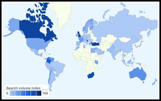
Whilst researching for this event, I came across a highly informative and relevant blog posting on Pingdom which has charts showing the popularity of the top social networking sites across the world. They have used Google Insights to produce charts from the most common search strings to illustrate each site's popularity on world map.
Here is the one they produced for Facebook:
No comments:
Post a Comment